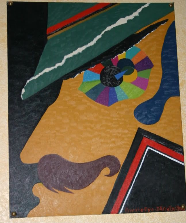
This is my first oil painting where the assignment was to make an abstract collage of different paper sheens, in one color tone of the color wheel and then to mix our own oil colors to the exact color of the magazine cutting. It was an excersize in color matching as well as abstract design. I chose the color tones shown in the eye, from an ad for a Benelton fall clothing line and then used a yellow manila envelope, the edge of a Time magazine, the torn cover of my art pad and a bright blue piece from an AT & T advertizement. I put them together into this abstract collage but the teacher didn't want us to make it into anything recognizable so I just turned the collage upside down when I presented it so that he thought it was just a collection of odd shapes.
I'm not very good at amorphous abstract and like more expressionist style art that has a message, even one as obvious as "Private Eye". For my first oil painting it was pretty cool and I sort of like how he's keeping an eye on the viewer.
No comments:
Post a Comment